

Natasha Carr
Brand Identity ✦ WEBSITE REFRESHA growing business with an identity that hadn’t kept up
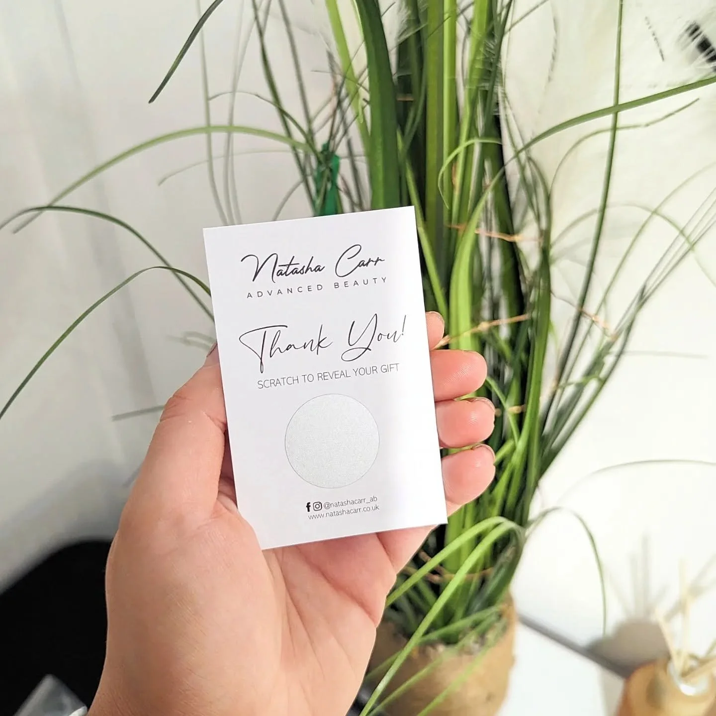
Natasha had spent years building her business and expanding the treatments she offered.
Her original branding had done exactly what it needed to do in those early days, but it no longer reflected the experience, confidence or range of services behind the business today.
This wasn’t about replacing everything for the sake of it. It was about creating a clearer, more cohesive identity around the business Natasha had grown.

Shaping a more refined direction
The new identity needed to feel established and contemporary while retaining the warmth and personal approach at the heart of Natasha’s business.
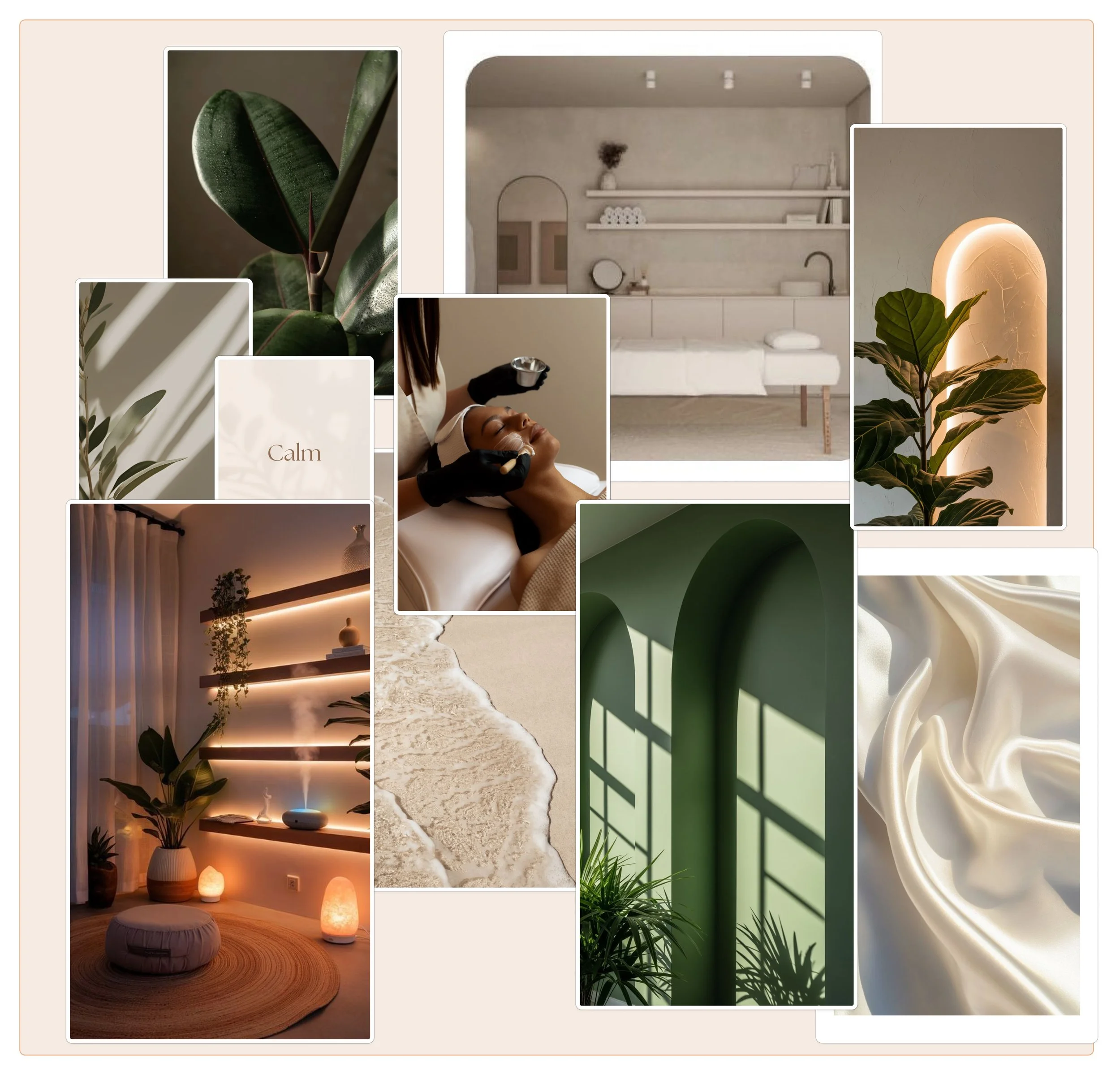
A palette of deep green, warm camel and soft neutrals brings everything together, creating a natural and considered feel without falling into the expected look of a traditional beauty brand.
Elegant serif typography brings a sense of confidence and refinement, while the NC monogram gives the brand a recognisable element that can work across smaller touchpoints.
Primary Logo
SECONDARY Logo
MONOGRAM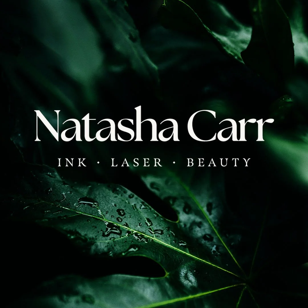
PRIMARY LOGO ON IMAGE
COLOUR PALETTE MOCKUP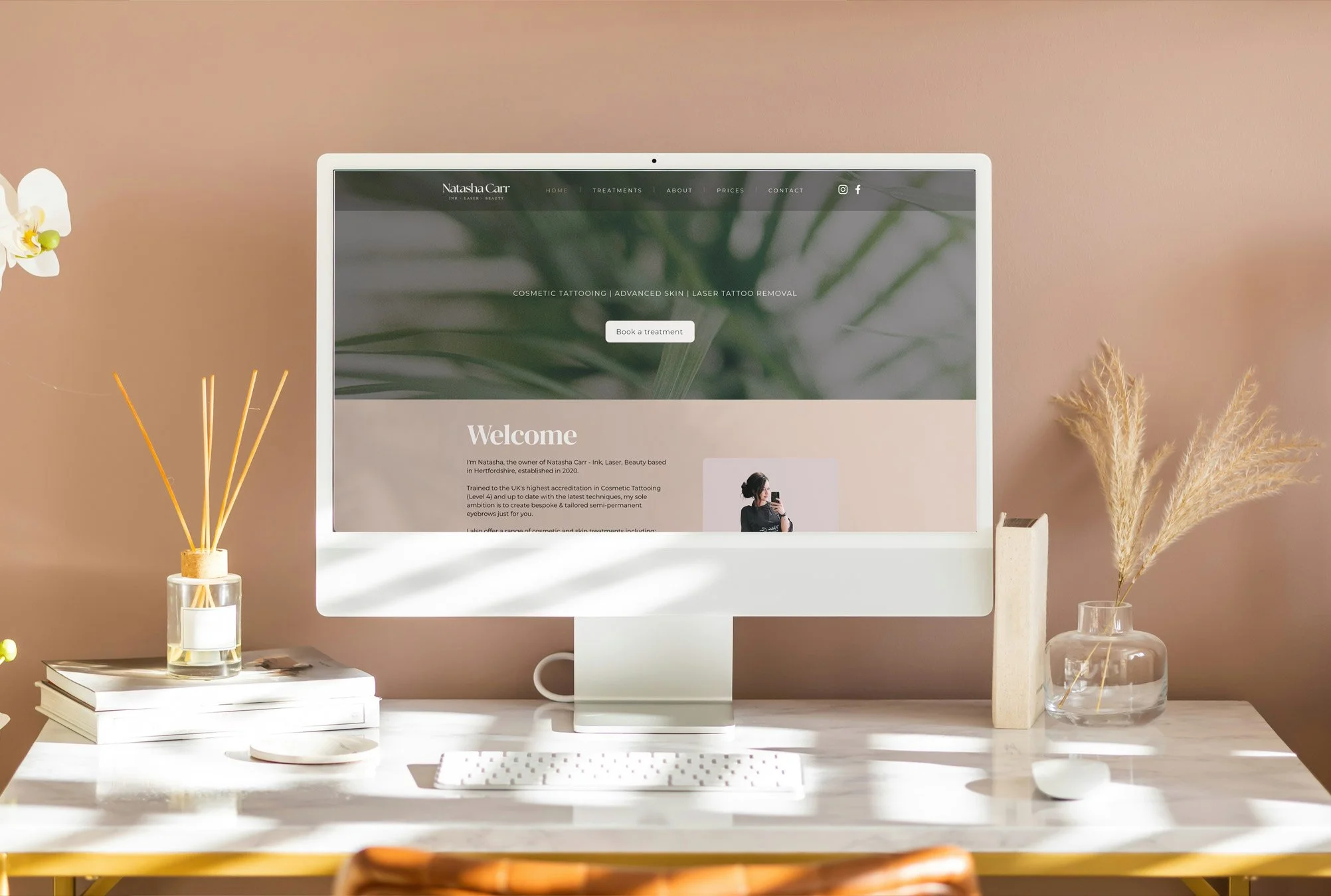
More than a new logo
The refreshed identity was designed as a flexible system rather than a single logo.
The wordmark, monogram, typography and colour palette work together across the website, social content and printed materials, giving Natasha a cohesive foundation as the business continues to grow.
That extended to the existing website, which didn’t need a complete rebuild. Instead, the new identity was applied to its existing structure, refreshing the overall look and bringing the customer experience in line with the new brand.

Natasha now has a brand that reflects the business she has built today, while giving her the flexibility to continue evolving it in the future.
The project included:
✦ Brand direction
✦ Logo suite
✦ Colour palette and typography
✦ Website refresh
A brand ready for what’s next
Thinking about your own brand?
If your business has grown but your branding still reflects where you started, let’s create something that feels more aligned with where you are now and where you’re heading next.